Choosing Interior Paint Colors That Work With Colorado’s Bright Natural Light in Broomfield
Colorado’s bright natural light is one of the best parts of living along the Front Range, but it changes how every paint color looks inside your home. The same shade can look crisp and fresh in one room and washed out in another, all because of how the intense sun pours through your windows. If you want interior paint colors that feel right all day long in your Broomfield home, you need to understand how Colorado light works. Here is a guide to choosing colors that shine.
Why Colorado’s Bright Natural Light Changes Everything
Intense natural light affects paint colors more than most homeowners expect. Colorado’s high-altitude sun is strong and clear, and it can saturate or fade a color depending on the room, the time of day, and the direction the windows face.
How Natural Light Shapes Interior Paint Colors in Colorado Homes
In Colorado homes, natural light throughout the day reveals every undertone in a color. A beige that looks warm at noon may show cool undertones by evening under artificial light. Because Colorado light is so bright, saturated colors can appear more intense, while soft tones can look almost white. That is why paint samples matter so much. Seeing how the color interacts with the light in your own space helps you choose the right color with confidence.
North-Facing vs. South-Facing Rooms and Your Paint Color
Room direction changes everything. South-facing rooms receive warm, abundant light that makes colors appear brighter and richer, so they handle cooler and deeper tones beautifully. North-facing rooms get softer, cooler light, so warm neutrals help those spaces feel more natural and inviting. Matching your paint color to each room’s light keeps the whole home feeling balanced.
A Guide to Choosing Paint Colors for Colorado Homes
With strong light in mind, certain color families consistently perform well in homes across Colorado. These shades hold up to bright sun without feeling harsh.
Warm Neutrals, Greige, and Taupe That Handle Bright Light
Warm neutrals are a reliable starting point. Greige, a blend of gray and beige, and soft taupe both handle intense natural light gracefully, staying grounded rather than washing out. These timeless colors pair beautifully with the natural wood elements and mountain views that Colorado homes often feature, helping your space feel connected to the landscape outside.
Off-White and Neutral Shades for Living Rooms and Home Offices
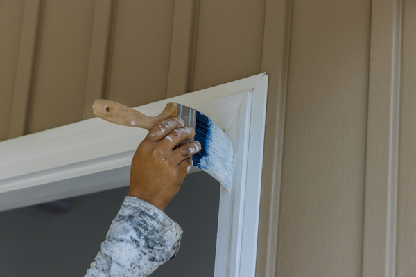
For living rooms and home offices, off-white and warm white shades create a bright, open feel that makes rooms look larger. Paired with clean white trim, these neutral tones reflect Colorado’s abundant light without glare. They also give you a flexible backdrop, letting furniture, art, and accent colors take center stage. Homeowners who want a fresh, versatile look often start here. A professional interior painting team can help you test these shades in your own light.
Adding Depth With Accent Colors and Accent Walls
Neutrals give you a strong foundation, but accent colors add personality and depth. The trick is choosing accents that complement your palette rather than compete with it.
Choosing an Accent Wall That Complements Your Color Palette
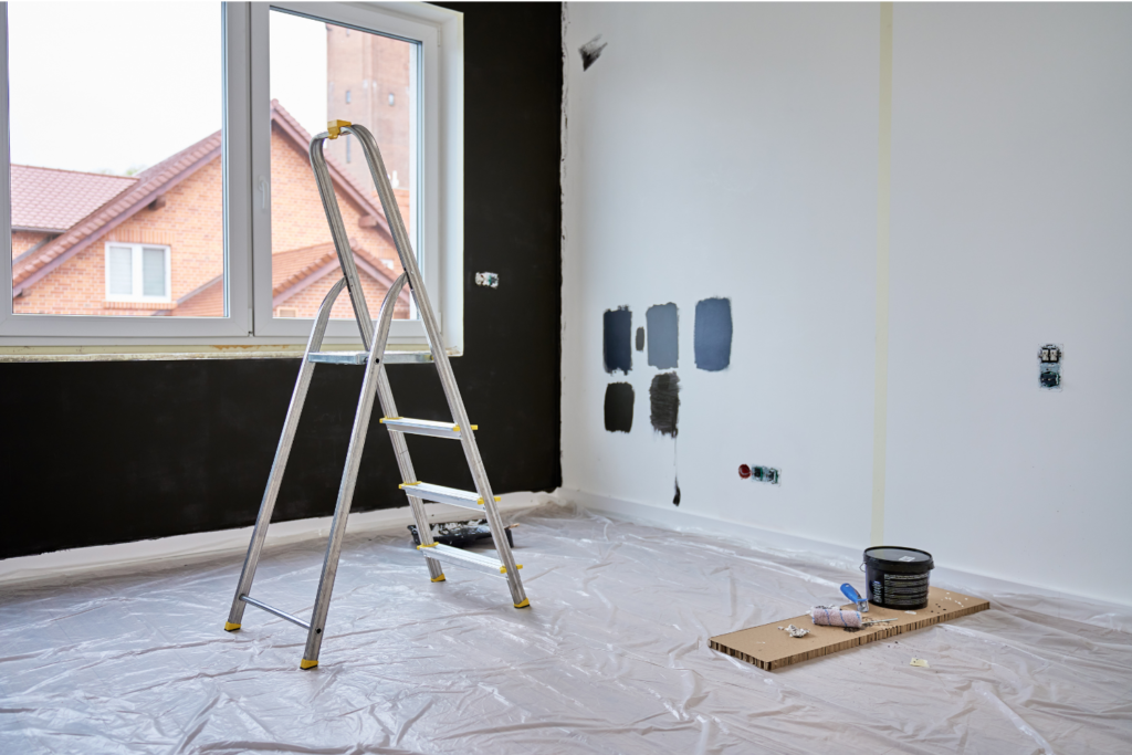
An accent wall adds a pop of color without overwhelming a room. Darker colors and muted green tones work especially well as accents in Colorado, since bright light keeps them from feeling heavy. Choose an accent that shares undertones with your main color palette so the two feel intentional together. A deep blue, a soft green, or a rich charcoal can anchor a space beautifully.
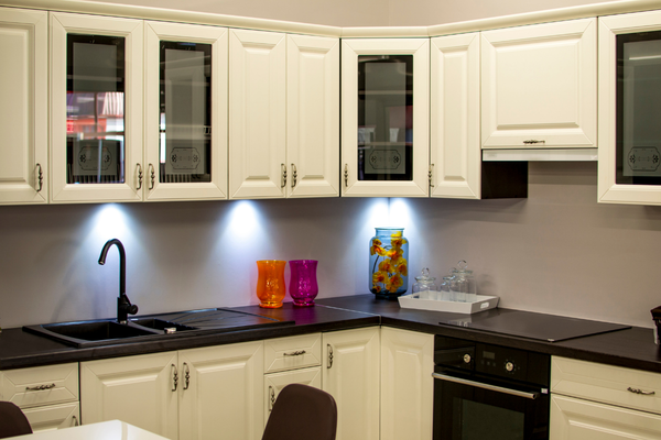
The Best Paint Colors for a Powder Room or Cabinet Paint
Small spaces invite bolder choices. A powder room is the perfect place for a saturated color or a moody muted green that would feel like too much in a large room. Cabinet paint offers the same opportunity in a kitchen or bath, where a warm neutral or deep tone can transform the space. Refreshed cabinet painting instantly updates a room without a full remodel.
How the Right Interior Paint Supports Home Design and Resale Value
The right interior color does more than look good. A cohesive color palette ties your whole home design together, making each room flow into the next. Timeless neutrals and thoughtful accents also boost resale value, since buyers respond to spaces that feel fresh, bright, and move-in ready. When you plan colors that fit both your style and Colorado’s light, you protect your investment and your everyday enjoyment of the home.
Why a Professional Color Consultation Helps You Choose the Right Colors
Choosing the perfect color gets far easier with expert guidance. A professional color consultation takes the guesswork out of the process, helping you see how each shade interacts with your home’s natural and artificial light before you commit. Experienced painters understand how Colorado’s intense sun affects paint colors and can recommend the best color direction for your home, room by room. That expertise saves you from costly repaints and delivers a finish you love. To explore colors and professional painting services in Broomfield, connect with the team at TradePro Painting.
With bright Colorado light guiding your choices, the right interior paint colors will keep your Broomfield home feeling warm, fresh, and beautifully connected to the world outside.